Block Formatting Context
W3C
The block formatting context is part of the visual CSS rendering of a web page. It affects the layout by changing how the contained elements float and clear.
In a block formatting context, boxes are laid out one after the other, vertically, beginning at the top of a containing block. The vertical distance between two sibling boxes is determined by the ‘margin’ properties. Vertical margins between adjacent block-level boxes in a block formatting context collapse.
In a block formatting context, each box’s left outer edge touches the left edge of the containing block (for right-to-left formatting, right edges touch). This is true even in the presence of floats (although a box’s line boxes may shrink due to the floats), unless the box establishes a new block formatting context (in which case the box itself may become narrower due to the floats).
Creating a Block Formatting Context
Floats, absolutely positioned elements, block containers that are not block boxes (such as inline-blocks, table cells, and table-captions), and block boxes with ‘overflow’ other than ‘visible’ establish new block formatting contexts for their contents.
Here is a list cases which triggers a new block formatting context.
- float other than none
- position fixed or absolute
- display inline block
- table cells (elements with display: table-cell, which is the default for HTML table cells)
- table captions (elements with display: table-caption, which is the default for HTML table captions)
- overflow other than visible
- flex boxes (elements with display: flex or inline-flex)
Even though any one of the above will create a new block formatting context they may have some sideeffects that you don’t want. In other words float: left and display: table-cell both create block formatting contexts, but they don’t behave in the same way.
Using a Block Formatting Context to Prevent Margin Collapse
<div class="container">
  <p>Sibling 1</p>
  <p>Sibling 2</p>
  <p>Sibling 3</p>
</div>
.container {
background-color: red;
overflow: hidden; /* creates a block formatting context */
}
p {
background-color: lightgreen;
margin: 10px 0;
}
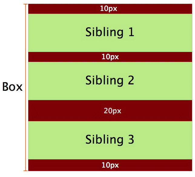
The vertical distance between two sibling boxes is determined by the individual margins of both siblings, but it’s not the sum of the two margins.
One thing that we must keep in mind is that vertical margins between adjacent block boxes (siblings) collapse only if they are in the same block formatting context. If they belong to different block formatting contexts then the margins between them won’t collapse. So by creating a new block formatting context we can prevent margin collapse.
<div class="container">
  <p>Sibling 1</p>
  <p>Sibling 2</p>
  <div class="bfc">
    <p>Sibling 3</p>
  </div>
</div>
.container {
background-color: red;
overflow: hidden; /* creates a block formatting context */
}
p {
margin: 10px 0;
background-color: lightgreen;
}
.bfc {
overflow: hidden; /* creates new block formatting context */
}
Using a Block Formatting Context to Contain Floats
<div class="container">
  <div>Sibling</div>
  <div>Sibling</div>
</div>
.container {
background-color: green;
}
.container div {
float: left;
background-color: lightgreen;
margin: 10px;
}In the above case the container won’t have any height and it won’t contain the floated children. To solve this problem we establish a new block formatting context inside the container by adding overflow: hidden. The modified CSS becomes:
.container {
  overflow: hidden; /* creates block formatting context */
  background-color: green;
}

.container div {
  float: left;
  background-color: lightgreen;
  margin: 10px;
}
Using Block Formatting Contexts to Prevent Text Wrapping
Sometimes the text around a floated div wraps around it but in some cases this is not desirable, we can also solve this with a block formatting context.
<div class="container">
  <div class="floated">
    Floated div
  </div>
  <p>
    Quae hic ut ab perferendis sit quod architecto,
    dolor debitis quam rem provident aspernatur tempora
    expedita.
  </p>
</div>
.container {
width: 500px;
min-height: 280px;
border: 1px solid #aaa;
padding: 10px;
}
.floated {
float: left;
margin: 5px;
}
p {
margin: 0;
text-align: left;
background-color: green;
color: white;
padding: 10px;
}In a block formatting context, each box’s left outer edge touches the left edge of the containing block, unless the box establishes a new block formatting context.According to this, if the p element establishes a new block formatting context then it will no longer touch the left edge of the container block. This way creating a new block formatting context solves the problem of text wrapping around a floated object.
Using Block Formatting Contexts in Multi-column Layouts
If we are creating a multi-column layout spanning the full width of the container, the last column will sometimes drop to the next line in some browsers.
We establish a new block formatting context in a column of the layout, it will always take the remaining space left after the previous columns have filled.
<div class="container">
  <div class="column">column 1</div>
  <div class="column">column 2</div>
  <div class="column">column 3</div>
</div>
.column {
width: 31.33%;
background-color: green;
float: left;
margin: 0 1%;
}
/* Establishing a new block formatting context in the last column */
.column:last-child {
float: none;
overflow: hidden;
}